
When going through the process of planning and decorating a space I usually keep the following four aspects in mind: the flow of the room, the proportion of the furniture in the space, the alignment of the decorative items and the aesthetic – what colours, textures, etc.
I would divide the process of styling a space as follow:
Step 1 – Proportion and usage
- Can the furniture do/store what I need?
- Are the pieces of furniture the right size for this space?
- Does anything look too small or, worse, too big?
Step 2 – Aesthetic
- What colours and textures do I like and want in the space?
- How many decorative items do I need to source?
- What is the main art piece I want to feature in that space?
Step 3 – Flow
- Is the furniture in the most suitable place?
- Does the room feel open and easily navigable?
- Does everything feel cohesive?
Step 4 – Alignment
- Is all the wall art aligned properly? Not too high? Not too low?
- Are the decorative items placed so everything feels balanced and not too symmetrical?
I very often visit a space and the furniture is just too big or too dark or the sofa has been angled so it completely closes the room and makes it feel smaller. I think a lot of people consider each item individually – “Oh, I like that sofa!”, “That poster is pretty cool”, “I really need a bookshelf” – not thinking of the bigger picture.
So today I thought I would use the example of a sideboard to explain how I think of all four aspects when styling a space. This is a fairly contained area but I use the same principles for all scale projects, big or small!
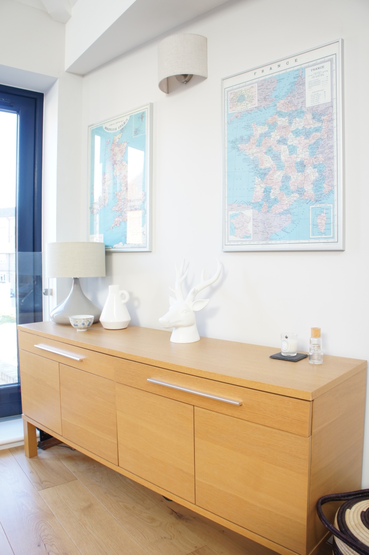
We needed some space to store some of our serving plates, glasses, and tableware in our open plan living-room. A sideboard was the obvious choice and I knew I wanted something contemporary, light and functional.
Our space is big, but the ceilings in that section of the room are low. We needed a sideboard that was long enough to fit everything and be noticeable, yet low enough that it wouldn’t make the ceiling height seem even lower. I also wanted a sideboard with narrow legs to bring some lightness and stay away from anything looking too chunky. So we opted for this now-discontinued Ikea sideboard (similar Ikea sideboard) which is big enough to store most things, low enough and budget-friendly!
Proportion and usage – Check!
As I mentioned above, I wanted to create a contemporary and light space, and I knew I wanted a ‘Scandinavian meet mid-century modern’ vibe. With that in mind, I went for an oak sideboard to bring in the Scandinavian warmth. I also wanted to hang a vintage France map I already owned, and this item dictated the colours for this space.
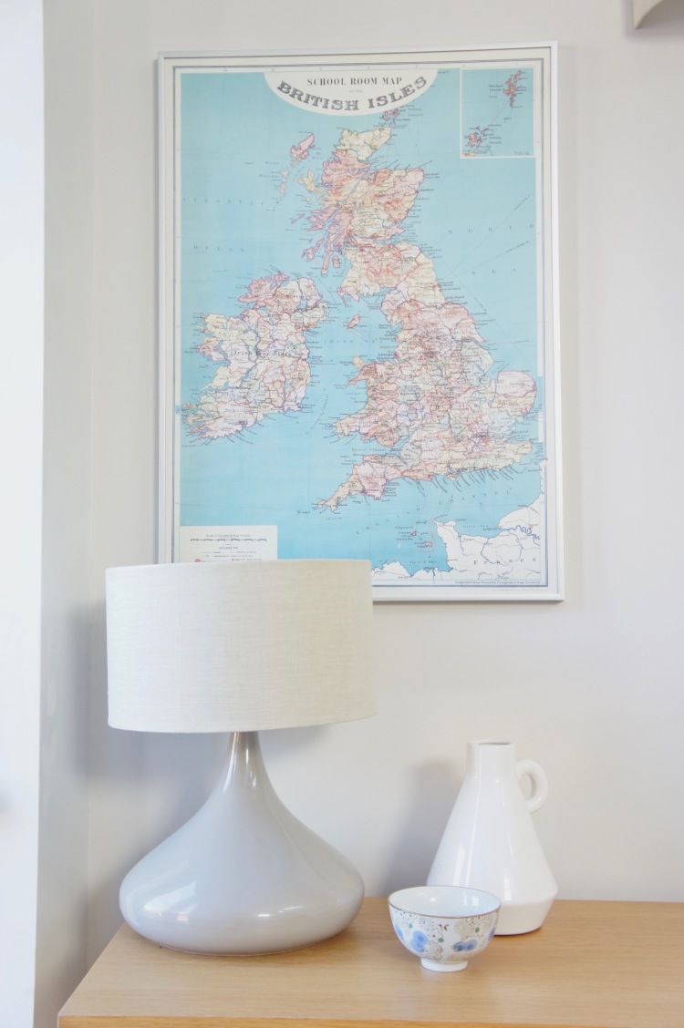
To bring the mid-century modern vibe I found this Conran for M&S lamp (old collection) which matched the colour palette of the map.
The size of the sideboard, the lamp and the map were my creative guides which dictated what other items I needed to source. I looked for a vintage UK map to mirror the France one. It created a symbolic interior moment for us, as I am French and Andrew is British. I also looked for small trinkets to dress the sideboard.
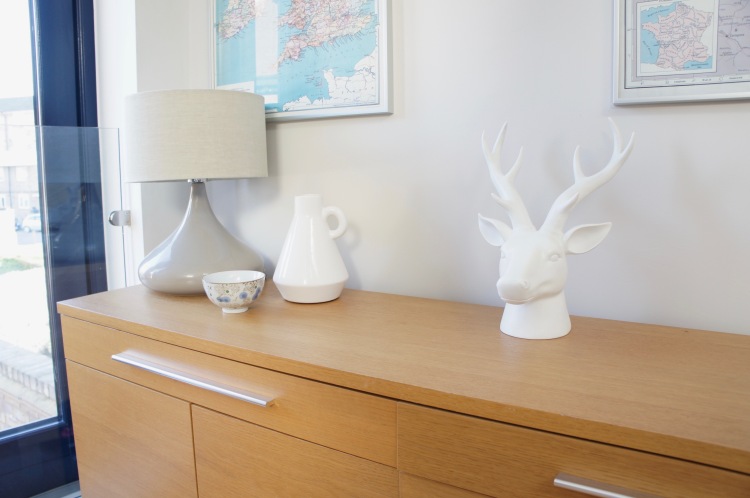
Sometimes in the process, an item will find you though. This was the case with the white stag head (similar). I was not looking for it, it found me, at Debenhams in Westfield London to be precise. I saw it, I needed it, I bought it, and it couldn’t fit better into that space. Plus, there are deer in the Nordic countries right? So it was perfect for my Scandinavian vibe!
Aesthetic – Check!
The flow part of the design process was pretty straightforward as the sideboard is against one of our walls in the living-room behind our sofa, and therefore completely out of the way. I still made sure that the sofa was placed so we have enough space to open the doors and easily access the shelves.
Flow – Check!
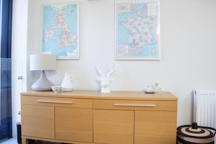
Now for the final step, the alignment! If there is one thing I really dislike in interior design, it is too much symmetry. I actually avoid symmetry as much as I can, and if I have to do it, I will try to disrupt it a bit. This is exactly what I did with the sideboard. I had two posters, which are exactly the same size and style, so there was no getting away from symmetry there. I framed both maps in Ikea metallic frames, bringing more grey to the area but also a different texture. I hung them next to each other, aligned with the sideboard.
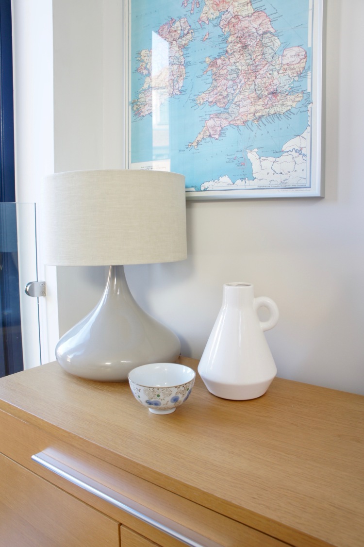
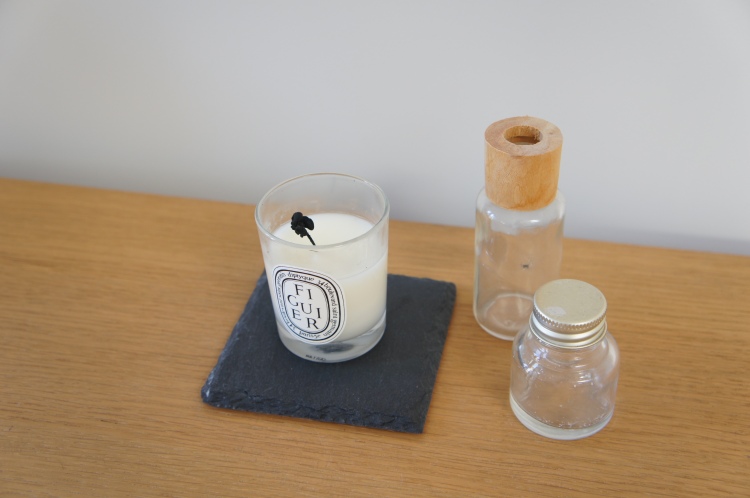
To ‘break’ the wall art symmetry, I grouped objects in three vignettes on the sideboard. On the left, I have the Conran for M&S lamp with a beautiful ceramic vase a friend bought me and a little bowl in the colours of the maps. In the middle, there is the stag head, and on the right one of my favourite Diptyque candles and little trinkets. So two wall art pieces plus three vignettes mean no more symmetry or pair numbers there!
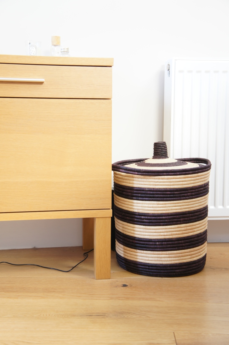
I also added a storage basket, found in TK Maxx, next to the sideboard, 1) to store all our cat’s stuff and 2) as I like the ‘stairs’ effect of a short and narrow item next to the long sideboard.
Alignment – Check!
I hope this post helps you plan and decorate your space! Keeping the big picture in mind is what creates beautiful, well-proportioned spaces!
Follow me on Instagram, Twitter, Pinterest, Youtube and Trover!

I really like the lamp, I feel like the candle and small bottles are lost on there however. I’d move the candle closer to the head, and do away with anything on the end. Sometimes design needs be unbalanced to have a more organic feel. Love the colour palette, it looks calming and fresh.
LikeLike
Claire I am not a trained stylist so keep an open mind please for the below because it related to my own personal aesthetic:
In terms of colours, I LOVE the maps and think they are really interesting and quirky and that’s a great combo to have around a credenza.
What I would do different thought: I would keep all the high elements to the left as you have, on the credenza, and then I would bring both maps lower and to the right over the credenza. I understand you have the wall light to consider but feel that the gap between the two maps is too wide right now.
Having said that, it may be the photo angle. Can I recommend you add wide angle lenses on your Christmas list? Total game changer. Come find me on Twitter today, will post a few examples of shooting a room from the same point, with and without wide angle lenses.
LikeLike
A nice step by step guide. Thanks so much for sharing
LikeLiked by 1 person